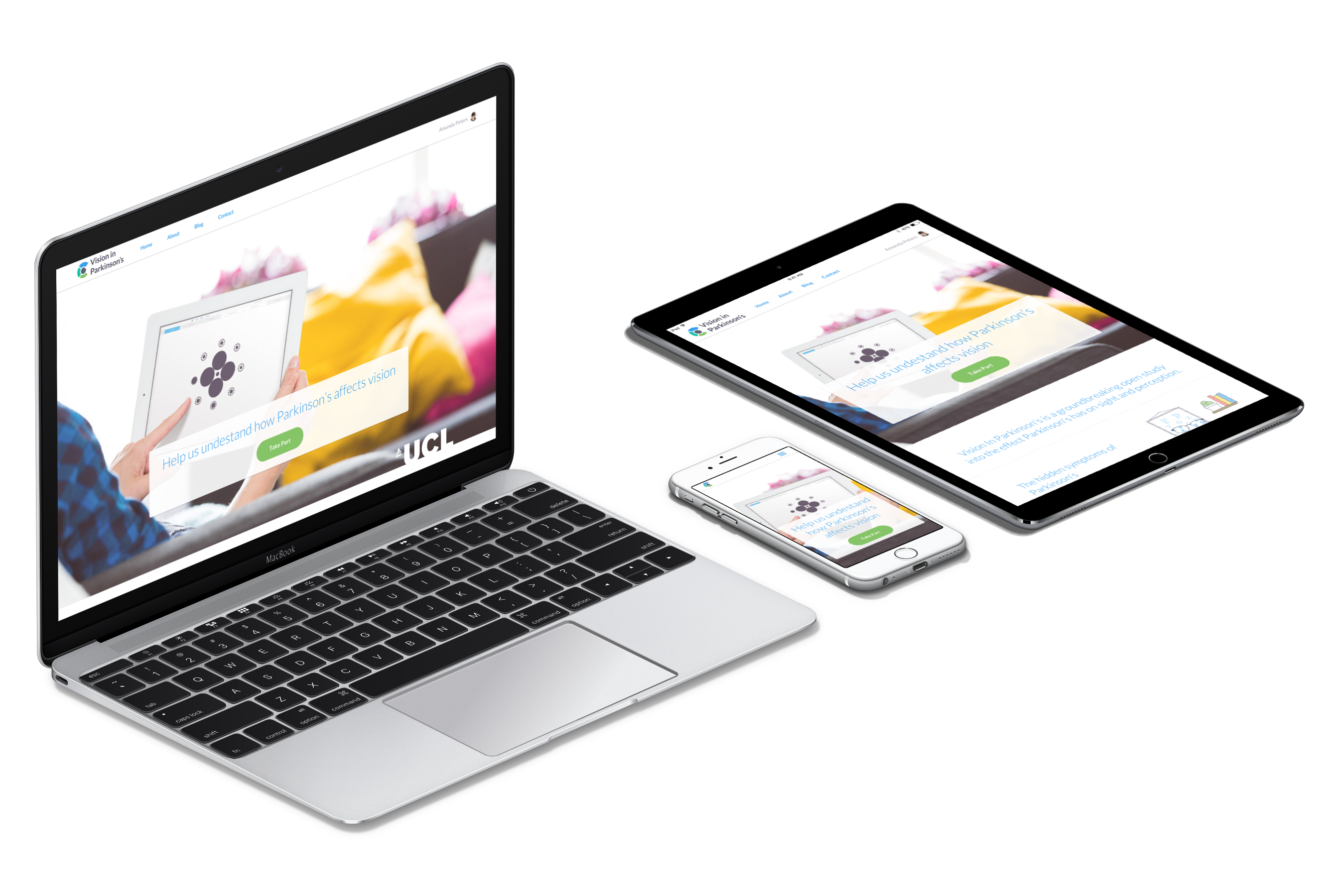
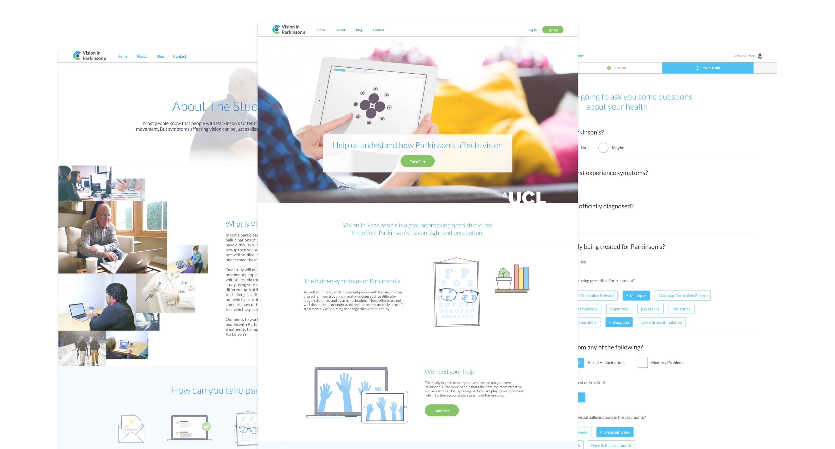
Vision In Parkinson’s is the world’s first web-based interactive study into the effects of Parkinson’s on patients’ vision. We worked with Dr Rimona Weil at UCL to build a web app that engages and excites participants while collecting important insights through a series of interactive tests.
Parkinson’s Disease affects up to 1 in 7 people over the age of 70. It’s most commonly recognised symptoms are those affecting movement, but is also known to affect other processes including how we sleep and how we think. New research has suggested that vision tests may be able to provide important clues to suggest how and why this is. When we were approached by Dr Rimona Weil with the idea of studying this through an open, web-based test we were very excited. The project presented the perfect mix of technical challenges, design constraints and opportunity to build something that can have a positive impact on peoples’ lives.
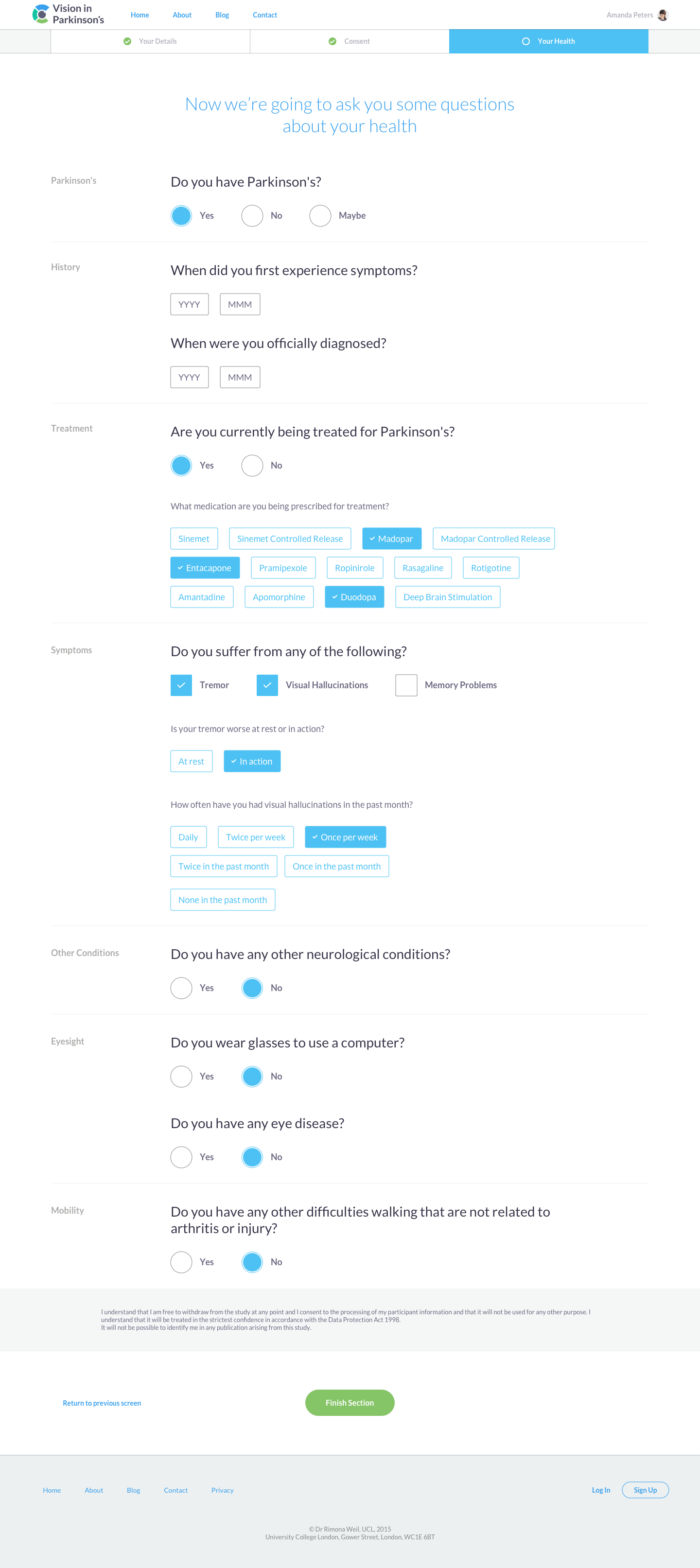
We were tasked with taking a set of long health questionnaires and a series of complex vision tests and turning them into an engaging online experience. The test would need to appeal to a wide audience in order to capture the scale of data needed, covering a range of ages, Parkinson’s patients, healthy control participants. The .
Dr Rimona Weil, UCL
Strategy
Product Design
Front-End Development
Back-End Development
User Testing
Public beta
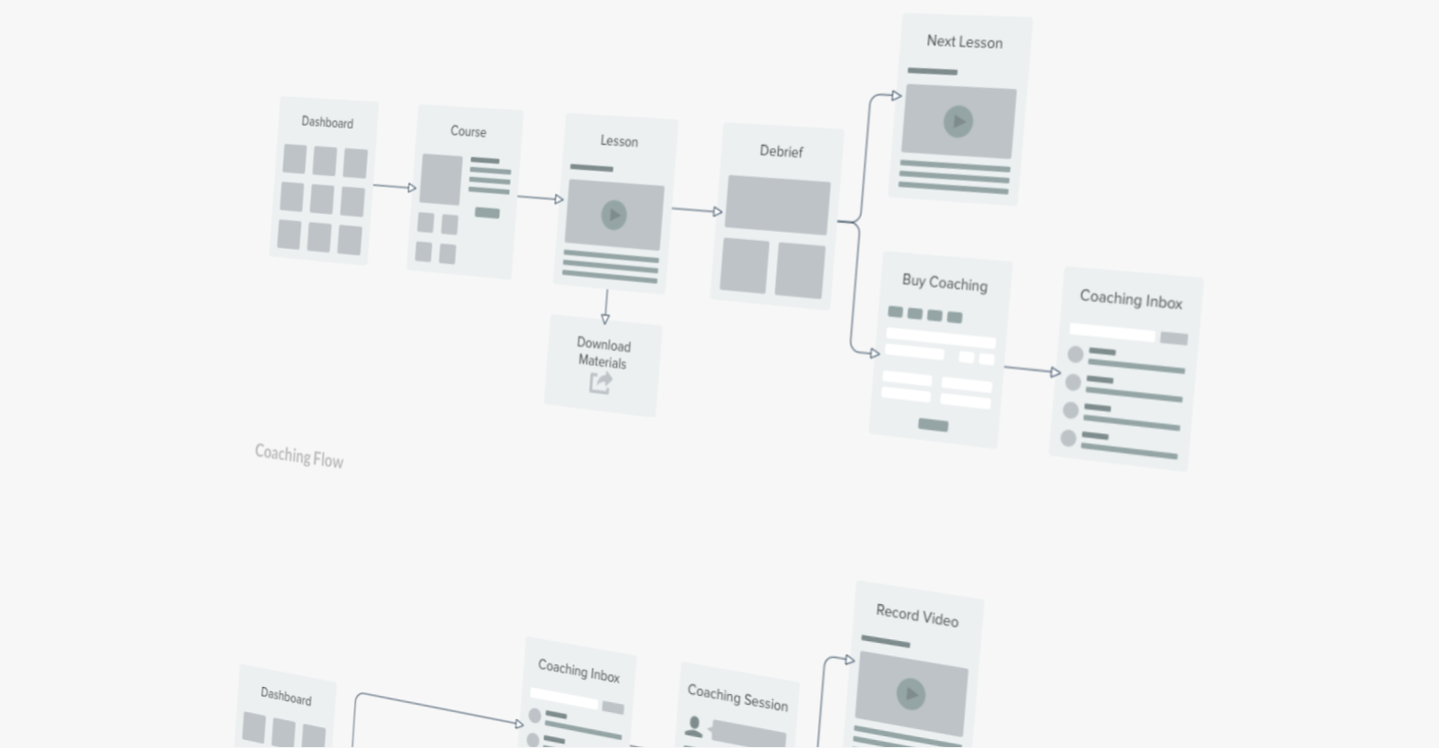
Applying our user-centered product design process to an academic study proved to be an interesting challenge but ultimately very rewarding. Exploring different solutions we were able to step back from the academic requirements and consider things from the perspective of what would work best for users. We broke the app up into three separate sections (questionnaire, callibration and vision tests) each with their own sub-set of tasks. The intention here was to create a flow with enough breaks that users would see and feel that they are making progress at each stage.
Although the test is open to anyone with a computer the primary audience is people with Parkinson’s. Given that most people with the condition are over 50 and many have problems with movement accesibility and usability would also be key. The tests themselves are designed to be challenging, but it was important to make sure the challenge doesn’t give way to frustration.
The study itself is made up of three sections; a questionnaire regarding the participants’s health, a short set interactive tests for callibration, and a longer set of interactive tests each examining a different aspect of vision.
Digging into the existing back-end of the site and ambitions of the team it became clear that their existing app architecture, built entirely on WordPress, was getting in the way of growth and the ability to iterate. WordPress was working well for the non-technical members of the team though, allowing them to manage courses without any developer input. Using what we learned during Discovery we applied a new database architecture that supported our transition to a RESTful API, allowing WordPress to continue managing the site content. Resulting in a testable, stable and flexible back-end, without breaking the clients already established administrative flow.
Our primary objectives for the front-end were speed, responsiveness and flexibility. With the RESTful API decoupling the front-end from the back-end we evolved the design in parallel, keeping things very agile and moving quickly as we went. Equipped with Middleman and SCSS we adopted a pattern of continuous delivery for iterations and feedback. As part of the site handover we put together a library of UI components to enable the team to rapidly prototype new interfaces of their own in the future without worrying about compromising design consistency.
Flask
Angular
WordPress
MySQL
Docker
Middleman
SCSS


To be able to draw valid conclusions from a study you need to control for as many factors as possible. Given this study's reliance on expected viewing distances, screen sizes and distances between specific interactions it became clear that supporting mobile screens would introduce too much variance into the results. Cutting off support for mobile devices was so against the grain of our design philosophy we knew we had to come up with a solution.
The majority of the site responds perfectly to all screen sizes. However, once a user starts the test they must switch to a tablet or desktop computer. In order to make the transition as seamless as possible we offer users the option of emailing themselves a link which will bring them back to the exact same spot once they've moved to a bigger device.


We wanted to compliment the refreshed UX with an updated visual design. On the consumer side a consistent, high quality look and feel helped to increase trust and engagement with the site. It also helped to enhance MusicGurus' credibility when approaching professional musicians for partnerships. As an added bonus the updated design served as a clear signal, internally and to users, that this was the start of a new era for MusicGurus.
Since launching the project MusicGurus have seen rapid growth in both users and revenue. The team have reported a real positive impact on how their offering is perceived by both users and the artists they partner with. Our relationship with MusicGurus has carried on from the relaunch and we continue to help them design and develop new features for the platform.